

The AI Boom Isn't an Investment Boom
The stock market keeps setting records, but most Americans don't feel any richer. One number explains the gap, and the AI boom is making it worse.

Everyone is arguing about whether the AI investment boom is a bubble, and the debate is reasonable.
Investment in computer equipment has exploded from 0.5% of GDP to 1.3% in under three years, surpassing even the dot-com peak. It is one of the most aggressive booms in the history of US investment.
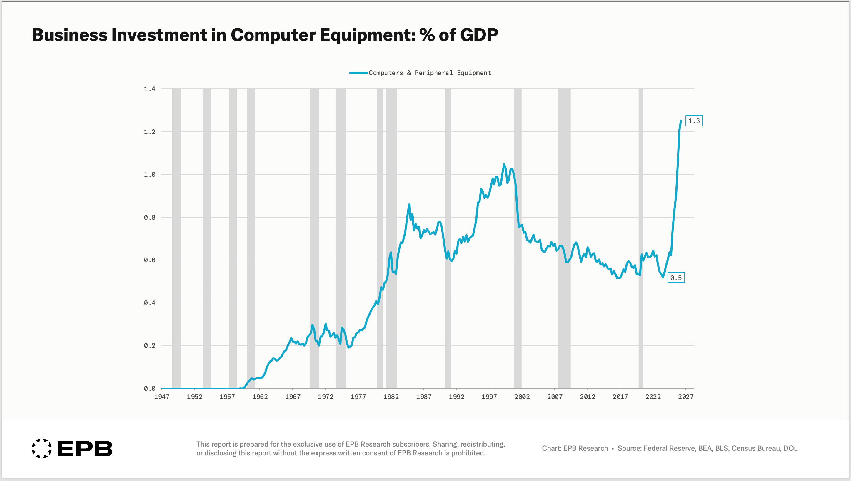
The spending is clearly real. The data centers, the computer equipment, and the race for new technology are pushing a true investment boom in this narrow slice of the economy.
But arguing over whether this is a bubble or not misses the bigger picture.
Total net investment, what the country actually adds to its capital stock after replacing what wears out each year, is near its lowest share of GDP outside the 2009 crash. That includes the AI spending boom.
That number, net investment, is the one number that explains the gap in perceived well-being, and it’s the subject of this post.
It explains why the stock market can keep setting records while most Americans don’t feel any richer. In fact, many feel worse off.
In this post, we’ll trace how the major buckets of GDP have quietly traded places over the last several decades, why the investment number everyone debates is measuring the wrong thing, how government deficits end up as corporate profits, and what all of it means for the AI boom and the standard of living of the average American.
How The Economy Changed Over The Past 70 Years
GDP = consumption + investment + government expenditures + net exports
Sometimes, you may see this written as:
GDP = C + I + G + NX
Every dollar of GDP lands in one of these four buckets: consumption, investment, government expenditures, or net exports.
This chart shows these four buckets as a % of GDP, averaged by decade, from the 1950s through today.
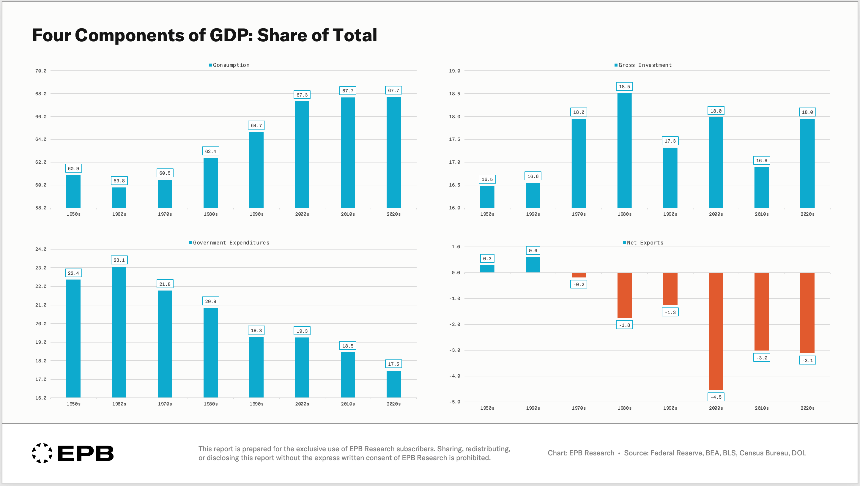
Consumption rose from 61% of GDP to 68% today. A seven-point increase.
Government expenditures moved the other way.
This is a bit counterintuitive with all the talk about big government deficits; how is it that government spending is contributing less to GDP?
In the GDP accounting, this only measures direct government expenditures. Today, most government spending is social transfers, like Social Security, which go to households, and households then spend it on consumption, which is where it gets recorded in GDP.
So government spending is coming through the consumption account with households as the vehicle, but we’ll expand on this more.
Net exports drifted from roughly balanced to a persistent deficit near 3% of GDP.
And gross investment did nothing. It averaged 16.5% of GDP in the 1950s. This decade it's averaging 18%.
Seventy years, no trend. By this measure, America invests as much of its output as it ever has.
That number is true, but it’s completely misleading.
The Truth Behind Investment: Gross vs. Net
Gross investment counts every dollar spent on structures, equipment, and intellectual property. There’s no distinction between the dollars that go towards building something new versus replacing something that is worn out.
Machines wear out, buildings age, and software goes obsolete.
Replacing what’s worn out is called consumption of fixed capital, or as it’s more commonly known, depreciation.
Before the capital stock can grow, investment first has to replace everything that wore out that year. What’s left over, gross investment minus depreciation, is net investment.
Net investment is the only part that makes the country’s capital stock bigger.
Net investment averaged 8% of GDP in the 1950s. Today it’s 3.8%.
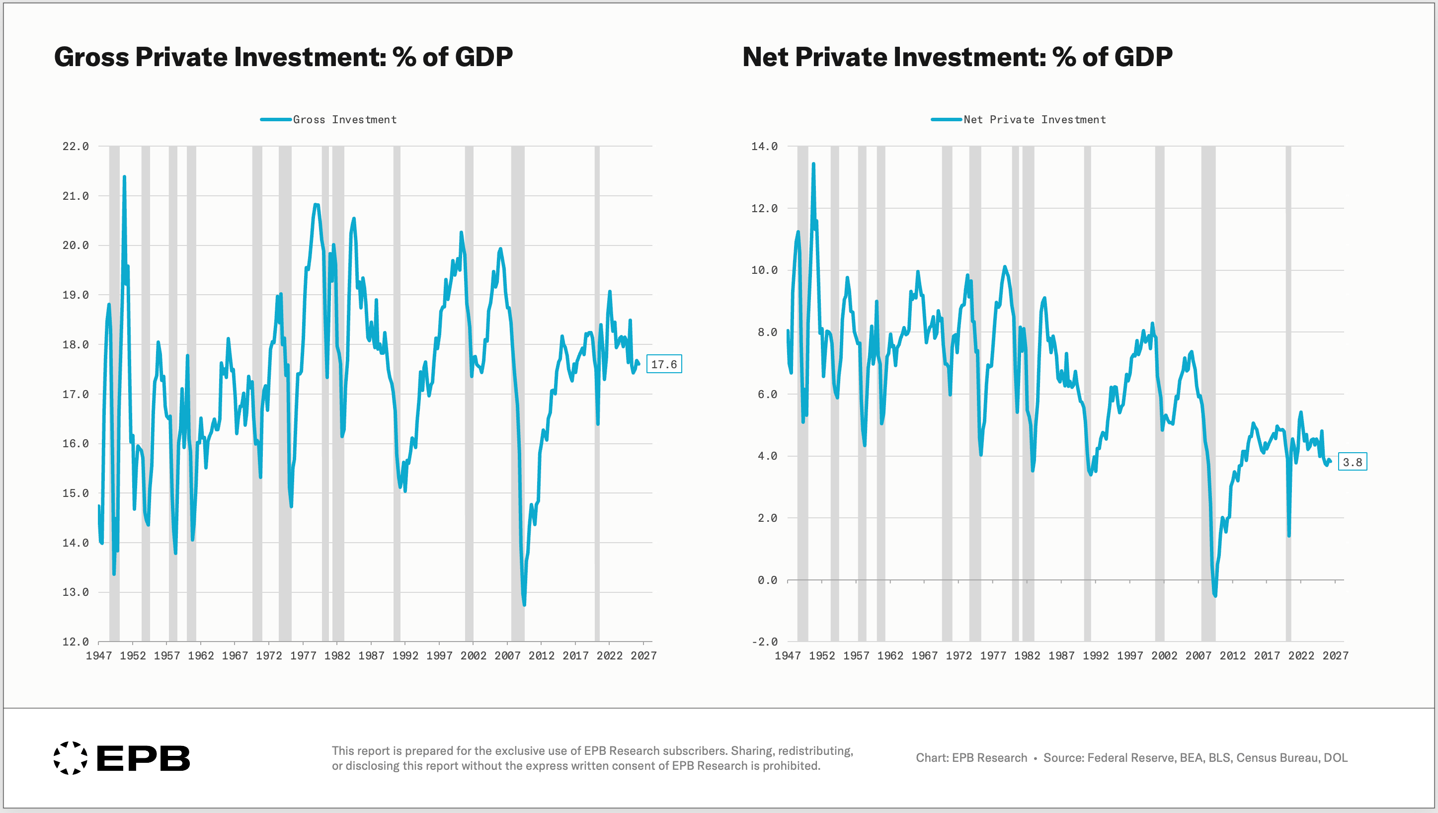
Gross investment has been flat as a % of GDP while net investment has been declining sharply. The net line is what truly impacts the future. Replacing what is worn out is the spending we have to do simply to stand still.
Consumption of fixed capital, or depreciation, increased from 8% of GDP to almost 14%. There are many reasons for this, but the biggest is the type of investment we do today versus 40-50 years ago.
Our investment shifted away from long-lived structures and buildings toward shorter-lived equipment, software, and intellectual property.
The Bureau of Economic Analysis publishes the service life it assumes for every type of asset, and the contrast is stark.
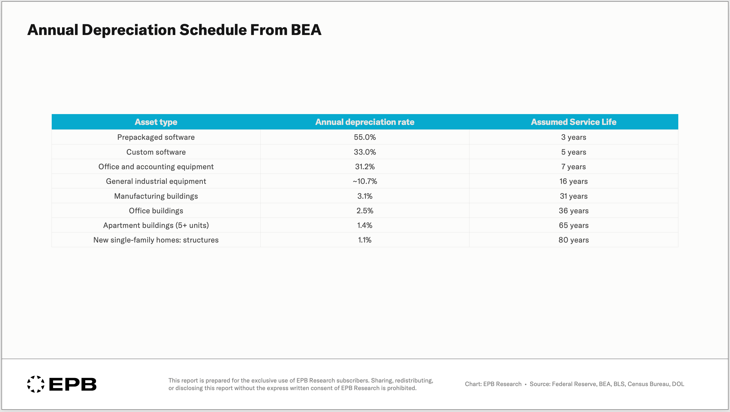
A dollar invested in prepackaged software is mostly gone in three years. A dollar invested in a house lasts a working lifetime.
Software depreciates roughly 50 times faster than a home.
As investment shifted toward the shorter-lived end, the replacement bill exploded.
~75% of Investment Is Now Maintenance
Let’s look at the trend of how much investment went toward consumption of fixed capital. In other words, for every dollar of investment, how much went to something new compared to replacing something old.
In the 1950s, 48 cents of every gross investment dollar added to the capital stock. Today, it’s 23 cents.
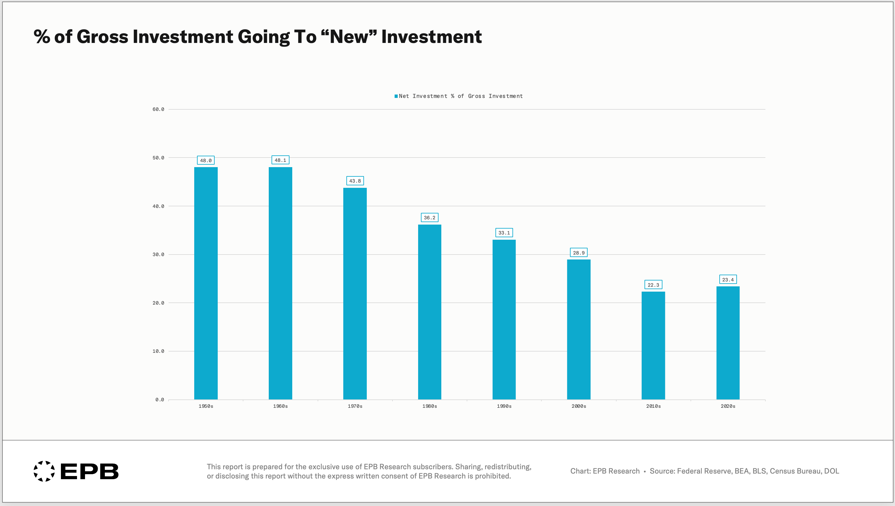
In the 1950s, about half of investment went to maintenance. Today, more than three-quarters does.
In 2009, the number went below zero. Gross investment fell so far that it couldn’t even cover depreciation. For two quarters, net private investment was negative.
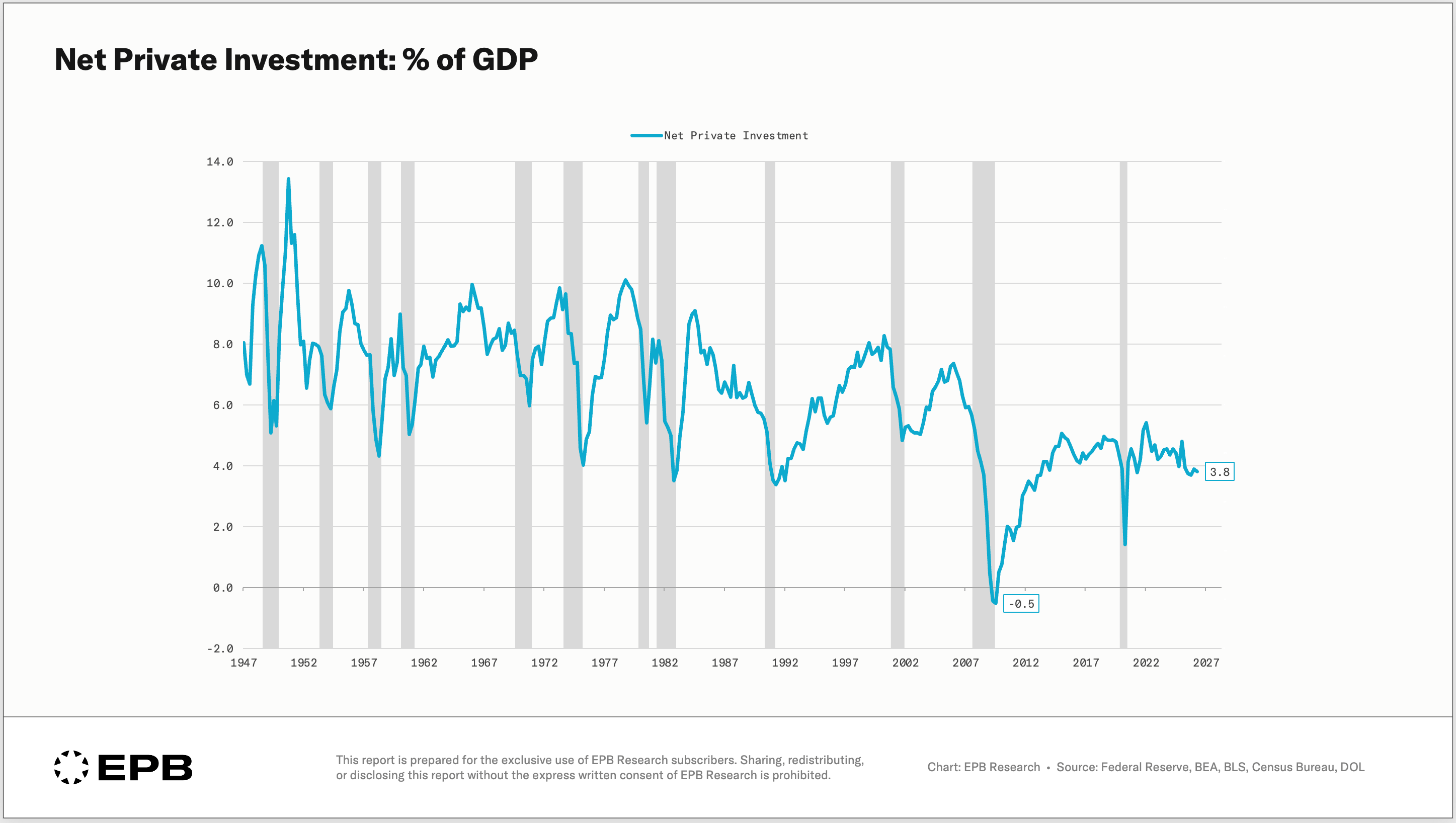
America wasn’t just failing to grow its capital stock. It was actually shrinking. And if the current trend continues, negative net investment is a level we could revisit even in expansion years.
Where the Government Deficit Actually Goes
None of this happened by accident. There is a mechanism, and it runs through the government budget.
Remember that government expenditures as a share of GDP shrank. But federal spending didn’t shrink. It increased. It simply changed form.
Government social benefits to persons were 5% of GDP in 1960. Today they’re over 15% of GDP, running at more than $5 trillion a year. Social benefits are primarily Social Security, Medicare, Medicaid, and other benefits like unemployment insurance and veterans benefits.
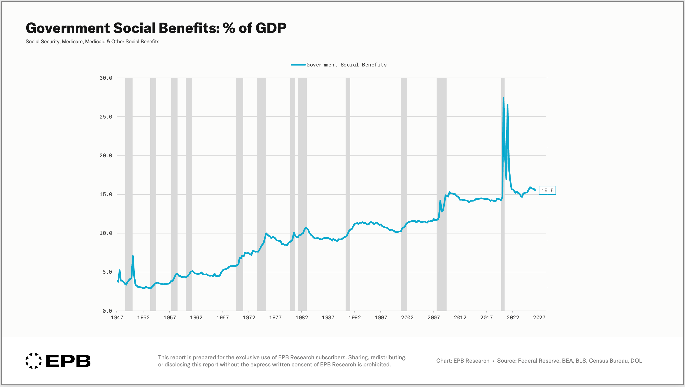
Transfer payments don’t show up in government expenditures in the GDP data as we covered earlier. They primarily show up as consumption when households receive the checks and spend them.
Now we have to connect the dots in the uncomfortable way that no one really wants to discuss.
The federal government runs a budget deficit near 7% of GDP, but we just saw how the social benefits are running near 15% of GDP. The transfer bill is more than twice that size. Transfers alone absorb 85% of all federal receipts.
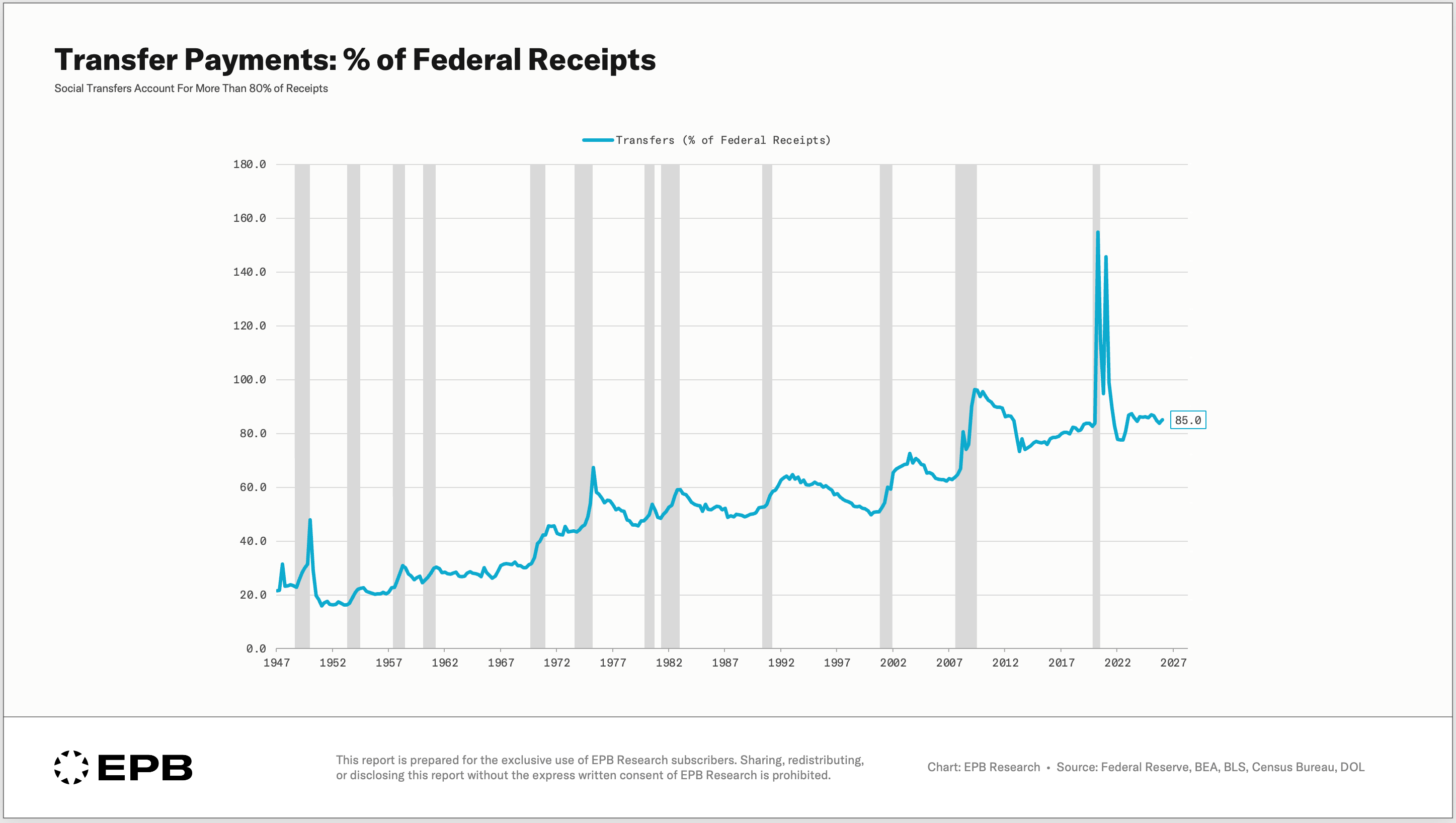
The deficit is not building roads, labs, and ports. At the margin, the government borrows money to fund transfers to households, which the households spend on consumption, driving consumption’s share of GDP higher while the net investment share grinds lower.
As a country, we are borrowing money to consume, but instead of households borrowing, the government is doing the borrowing for them.
Borrowed money is being consumed, not compounded.
Why the Stock Market Loves It
A check from a government transfer payment that gets spent shows up as business revenue. Deficit-funded consumption flows almost directly into corporate profits.
This is not a conspiracy theory or even a judgment about whether this is a good idea or not; it’s simply accounting, and it’s been running for four decades.
That’s why this arrangement has been extraordinarily good for corporate profits and the stock market.
After-tax corporate profits as a % of GDP have exploded over the last several decades.
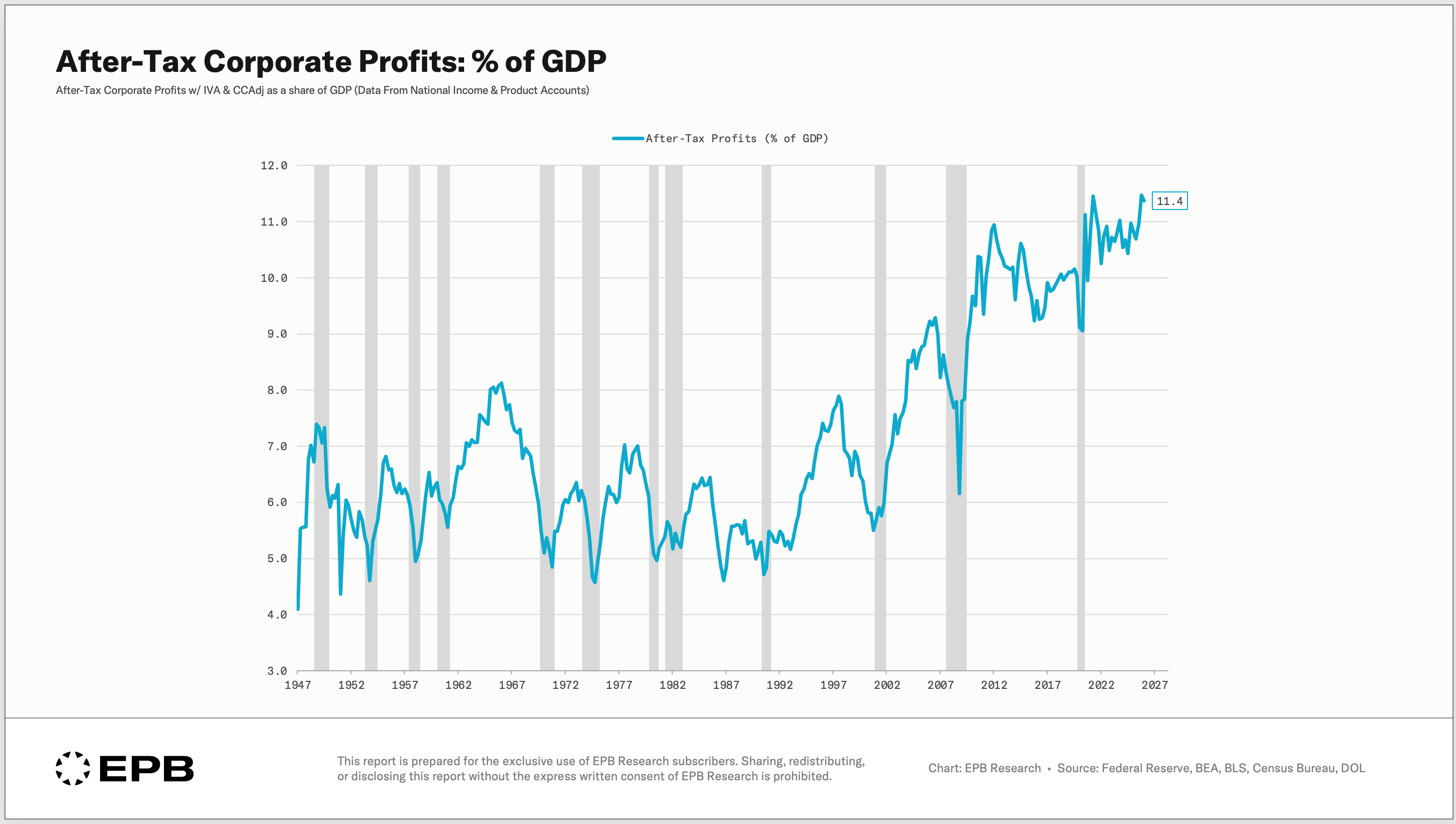
There’s nothing that says this has to stop. As long as the deficit continues to grow and markets facilitate the increased borrowing to fund transfer payments that funnel into consumption, corporate profits will have an extremely strong support base.
But we have to be honest about the foundation.
Profits are rising on borrowed consumption, not on a growing capital base. A far more durable foundation for profits is net investment that strengthens the country’s capital stock and productivity base.
The economy is not building the productive base that raises output per worker, but the mechanism underneath is supporting profits and will likely continue to do so.
The problem is that you can’t raise the standard of living through consumption.
Consumption is the standard of living.
Raising it requires producing more per person, and producing more per person requires capital and net investment: more tools, better machines, deeper infrastructure per worker.
That’s exactly the number sitting at multi-decade lows.
But What About AI?
The AI capex boom is real investment. The data centers are real, the chips are real, and the spending shows up in the national accounts.
But look inside the investment bucket.
Intellectual property products, which include software and R&D, went from 1.3% of GDP in 1960 to 5.5% today.
Over the same period, investment in residential structures fell from 5% to 4% and nonresidential structures fell from 3.6% to 3.2%.
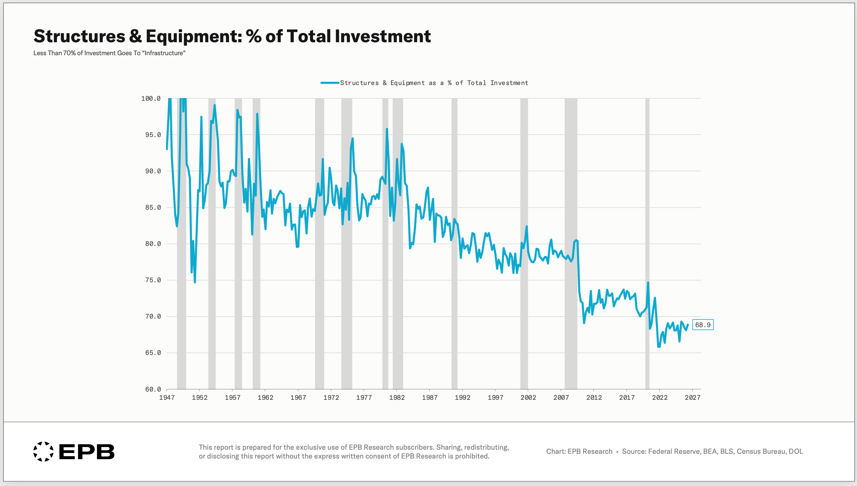
The AI boom is a reallocation inside the bucket, away from long-lived assets and toward shorter-lived ones. It is not an addition to the bucket.
Shorter-lived assets carry enormous replacement bills. The boom raises measured investment today and raises depreciation almost as fast tomorrow.
That’s why record AI spending can coexist with net investment near record lows.
That is not to say AI investment is bad or won’t pay off, but we are stealing investment from other categories to fund the AI spending, and the population experiences that trade as underbuilt housing and aging infrastructure.
Where This Goes, And What You Can Do
It’s clear how deficit-funded social transfers are fueling consumption, which drives corporate revenues and profits. The stock market, which derives its value from profits, loves this system.
At the same time, the capital stock of the country underneath is barely growing, and a country that consumes what it borrows ends up exactly where Americans are now: record stock market gains and profits, and a standard of living that barely moves.
Since stocks are held disproportionately by the wealthiest households, this dynamic widens the very wealth gap that the ever-increasing social benefits are meant to ease.
Now, everything in this post is structural analysis: the long-term, multi-decade forces shaping the economy.
It tells you what the American economy is becoming and where it’s going in the longer run, but it doesn’t tell you what happens in the next few quarters, and no recession was ever called from the consumption share of GDP.
That’s the part this post doesn’t cover.
What you need to do is watch the slice of the economy where the turning points actually start.
The shorter-term turning points, the sometimes violent swings in the economy, the unemployment rate, or the stock market, come from a very small, cyclical slice of the economy, and that slice moves in a repeated, watchable sequence.
Knowing where that narrow cyclical slice of the economy sits in its sequence is the work we do each week at EPB Research.
Every Sunday, I publish a free newsletter that analyzes the small group of business-cycle indicators that help determine whether economic growth is accelerating, slowing, or moving toward recession, all within the context of these longer-term secular trends.
When you join, you’ll also get the free Breaking Down GDP guide: a map of every line of the GDP accounts, including the small cyclical slices where the big swings begin, so you can read the report the same way we just did here.
If this article helped you understand how the AI boom can be real without being an investment boom, share it with someone who follows the economy or financial markets.
Solid analysis, as always.