

Record Profits, Falling Paychecks
US corporate margins just hit an all-time high while the typical worker's income slips below trend. The two are connected, and the reason isn't what most people think.

Corporate profit margins just hit 20.6%, the highest level on record.
At the same time, the income the typical worker earns from a job has stalled and slipped below the trend of the last expansion.
The average worker is falling behind while corporations are doing better than ever.
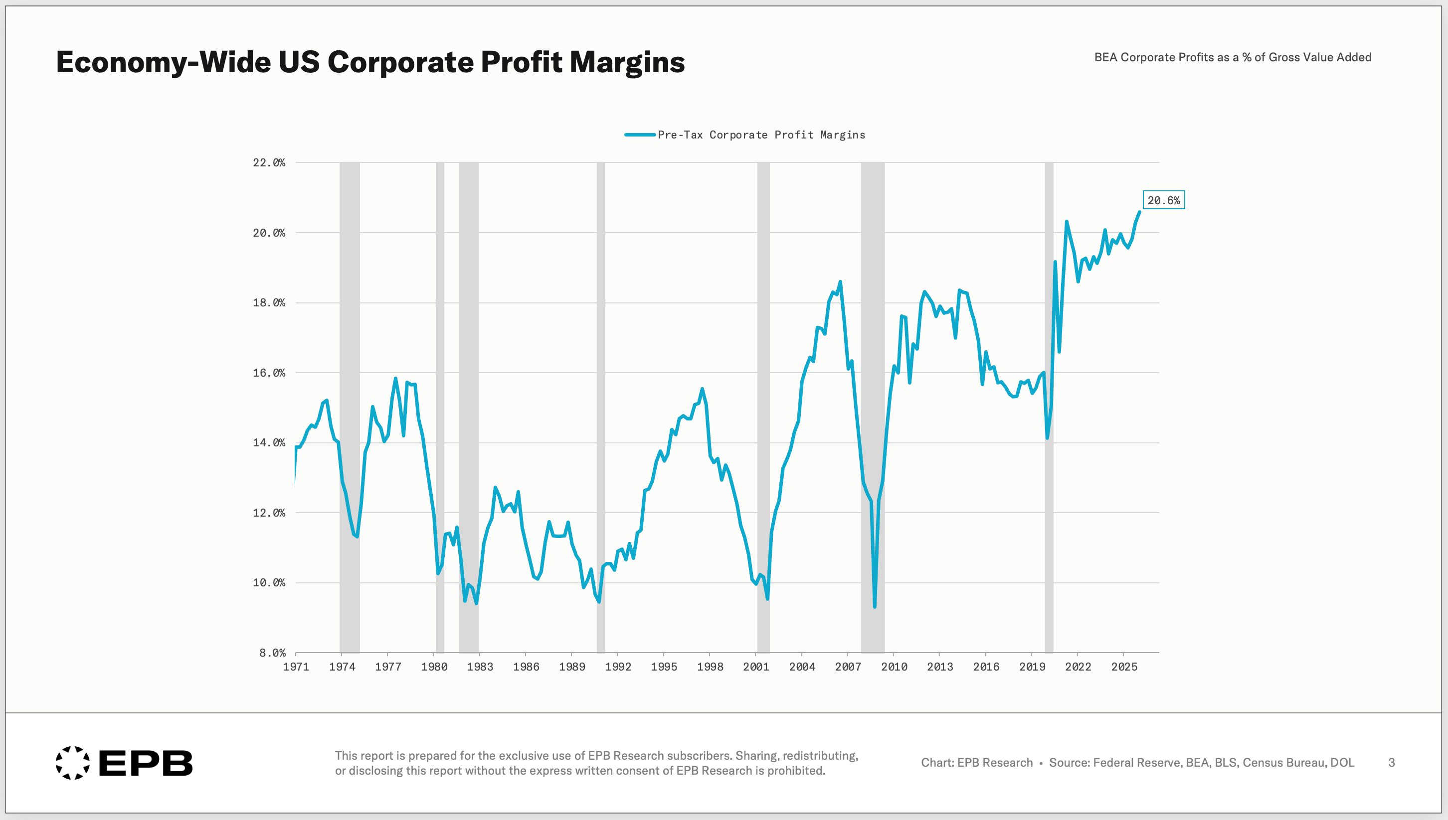
These are not separate stories.
They are actually two sides of the same coin.
For thirty years, a rising share of the economy’s total income has gone to capital and a shrinking share has gone to labor.
The stock market has responded as you’d expect, with record gains, but the average American has only felt worse off.
The reason runs deeper than corporate greed, Big Tech, or the surface-level talking points.
In this post, we’ll show how corporate profits are better than ever, why it’s happening, where this trend ultimately goes, and what you can do about it.
Record Profits, And Not Just Big Tech
The easy explanation for the record increase and all-time high in corporate profit margins is that a few trillion-dollar tech companies are dragging up the average.
This is true, but it’s not the answer.
The gains in corporate profitability are everywhere, not just technology.
Pre-tax margins in manufacturing hit 15% in 2022, cooled a bit, but still sit at nearly 13%, higher than any point in the last 25 years.
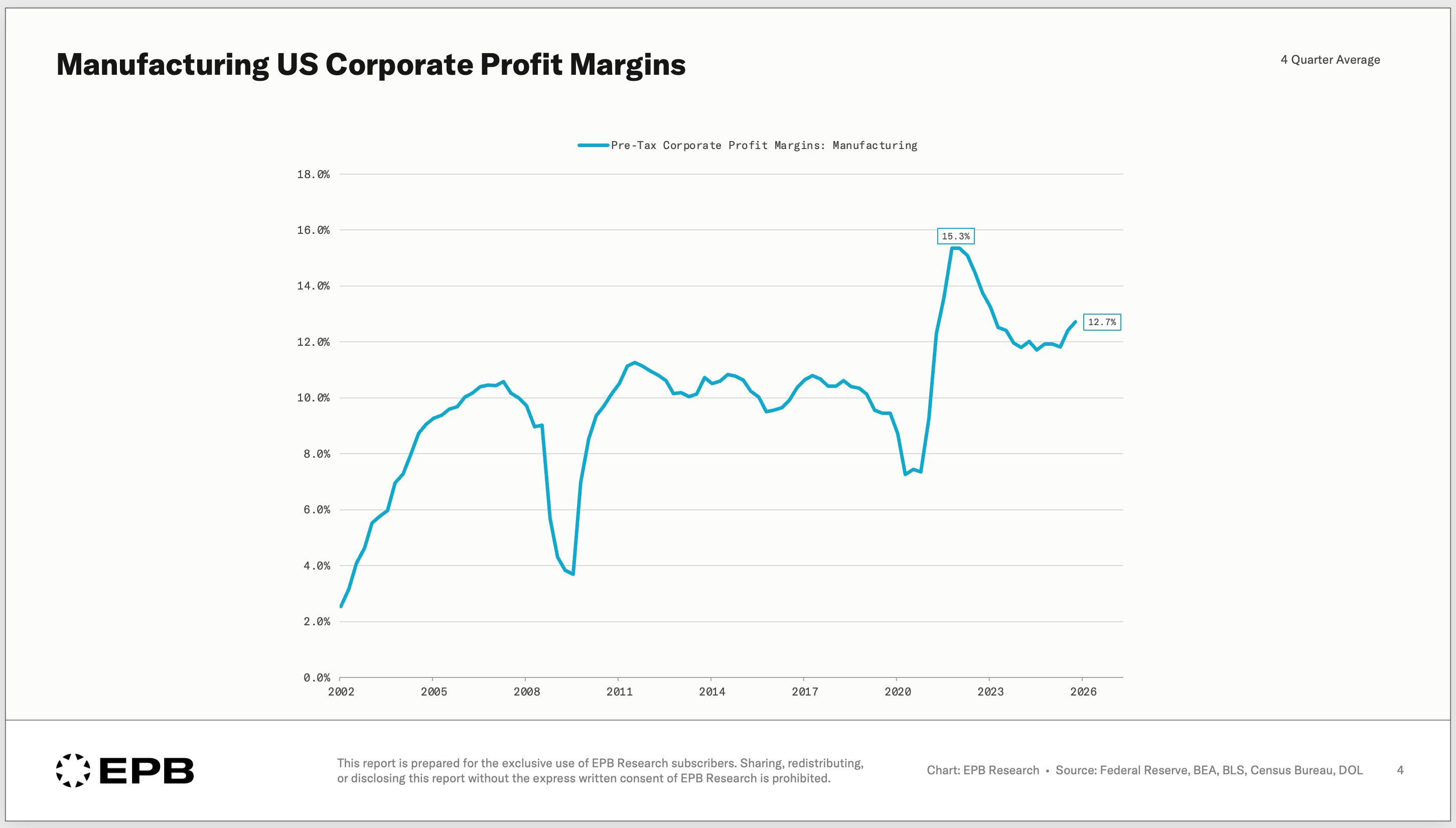
Corporate profit margins hitting all-time highs in every major industry is not a one-off or a cyclical dynamic; it’s a feature of how the economy has been structured and changed over time.
The Worker’s Shrinking Slice
Corporate profits and paychecks come from the same pie.
As one share climbs, the other has to fall.
In the following charts, you can think of “Gross Value Added” or GVA as business revenue.
Worker compensation averaged 64% of gross value added from 1970 through the turn of the century before falling sharply to 54%.
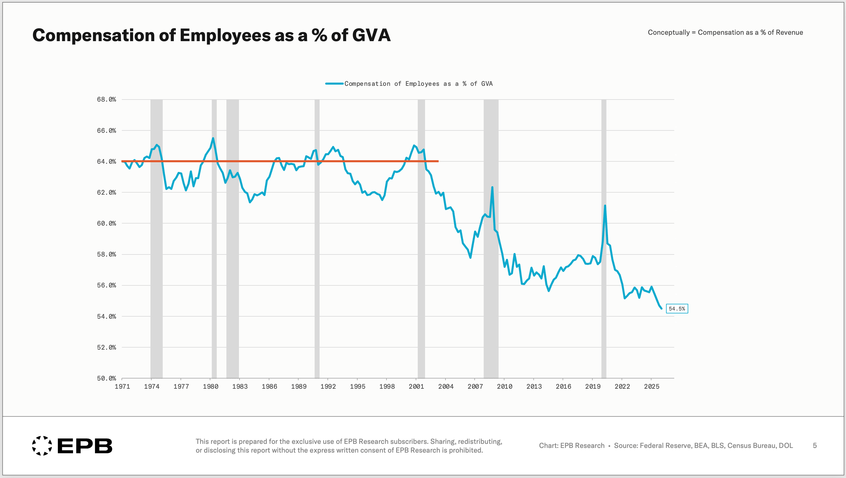
This is a 10-point swing from revenue going to wages vs. profits.
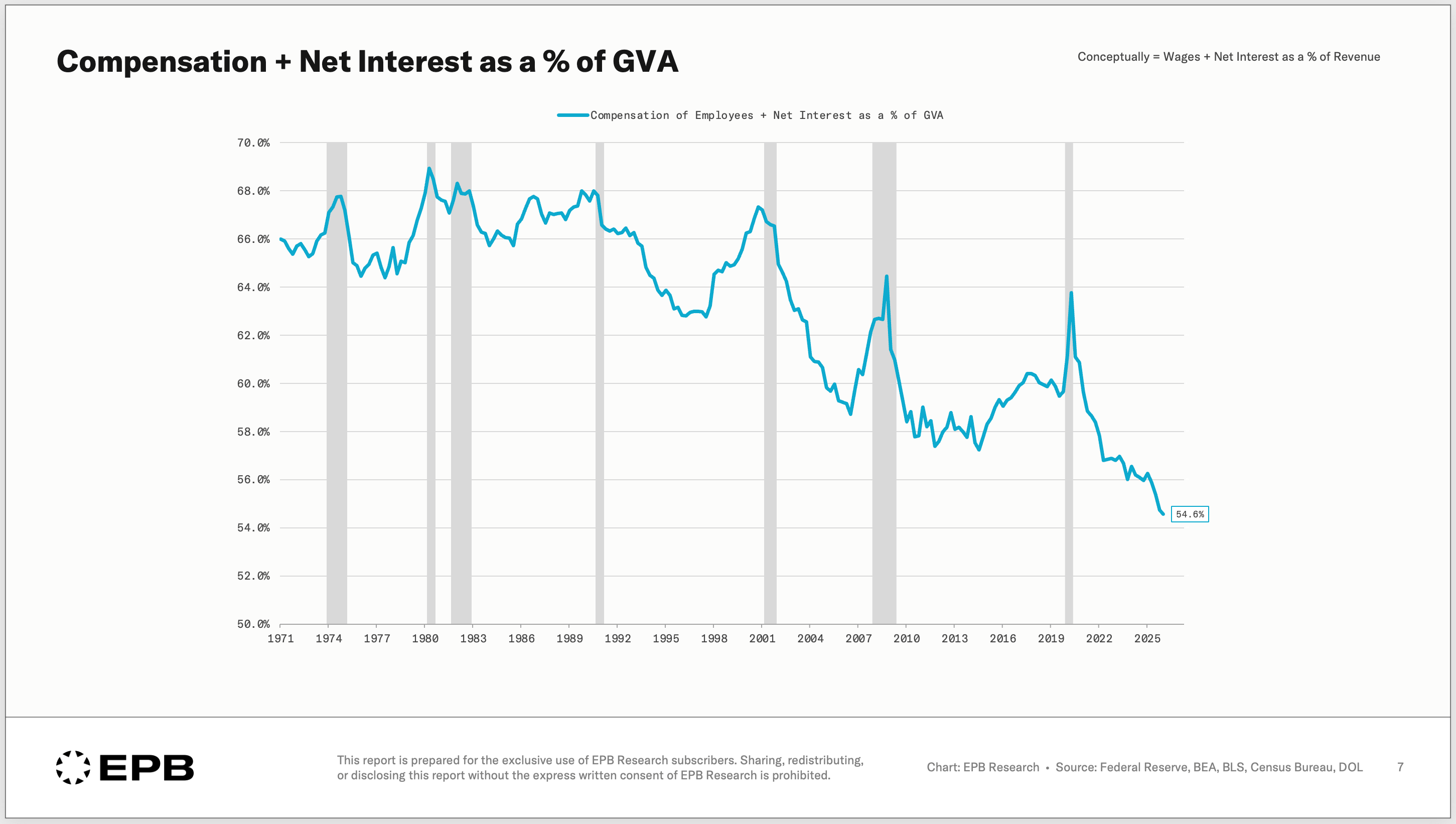
Companies also borrow money, so interest expense historically has been about 2% to 4% of revenue, but during the zero-interest rate environment, big corporations were able to take advantage of capital markets and issue long-term debt at low fixed rates, making them immune to the rate rising environment that followed.
Interest expense as a % of GVA is currently 0.1%.
Taken together, employee compensation plus interest fell from 66% in 1970 to 55% today, an 11-point boost to the bottom line.
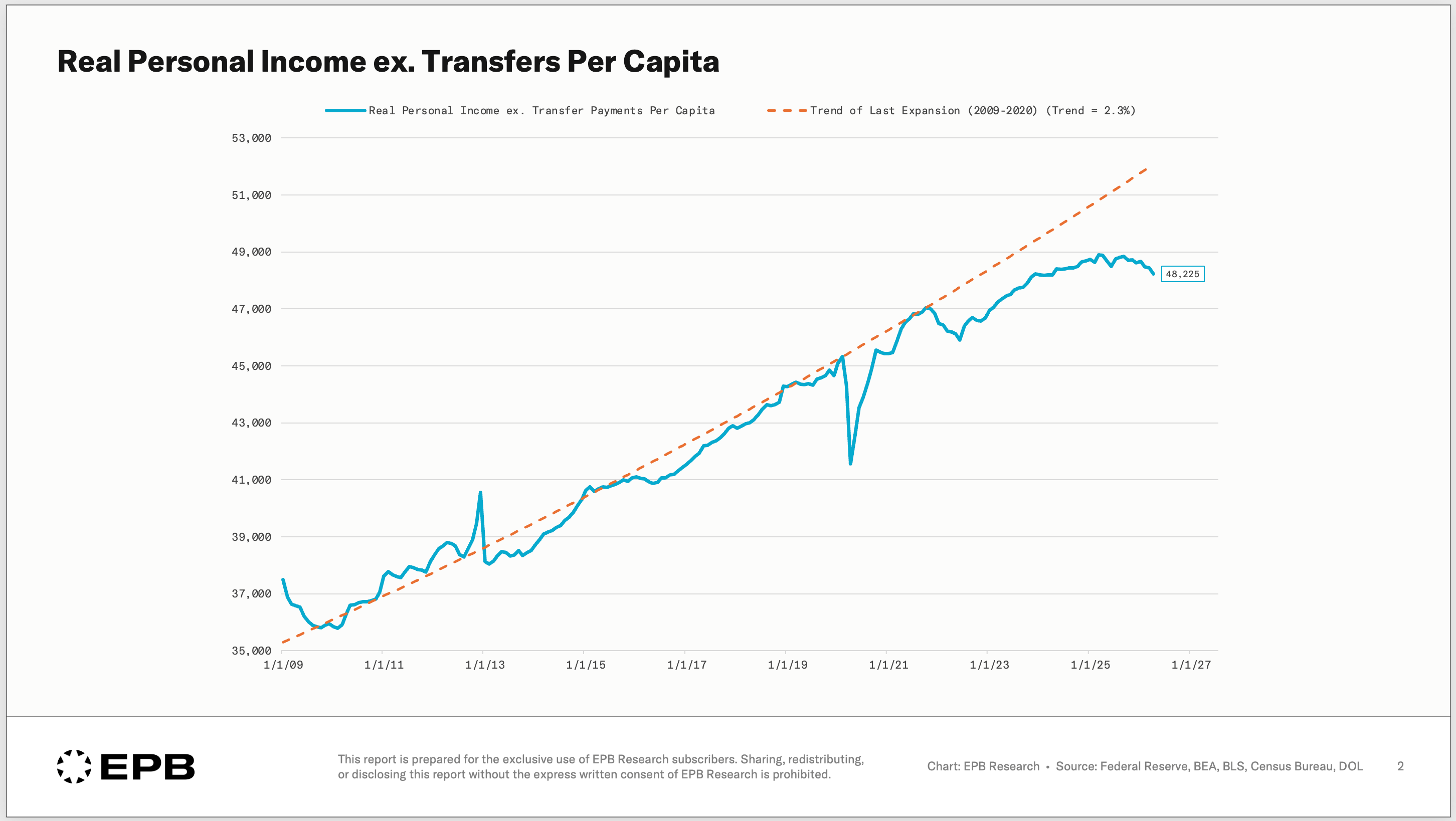
For the worker who doesn’t have a large net worth in assets or isn’t old enough to receive Social Security and Medicare, this trend shows up as a paycheck that has stalled, hasn't kept up with inflation, and is slipping below the long-term trend.
This chart shows real private sector income compared to the long-term trend line, and the gap is widening at an alarming pace, directly correlated to the poor sentiment that’s widespread in economic and political surveys today.
The real question is “how did this happen?”
The Real Driver: “Superstar” Firms
The answer has a name. Economists call them superstar firms, which is a polite term.
A National Bureau of Economic Research working paper titled “The Fall of the Labor Share and the Rise of Superstar Firms” discussed this dynamic in detail.
Of course, there is not one single cause, as many politicians looking for a scapegoat would want you to believe, but here are the main causes:
In industry after industry, consolidation and size allowed a small number of firms to capture a huge share of sales.
These larger firms with higher market concentration have more efficiencies and can run larger margins by design. As they outcompete the smaller firms, their share grows.
But here is the nuance. The labor share didn’t fall because companies cut pay.
It fell because the work moved to the giants. Real income did increase over time, but at a slower and slower pace and at a speed well below the gains in revenue.
So wages as a share of revenue fell, leading to more robust profits.
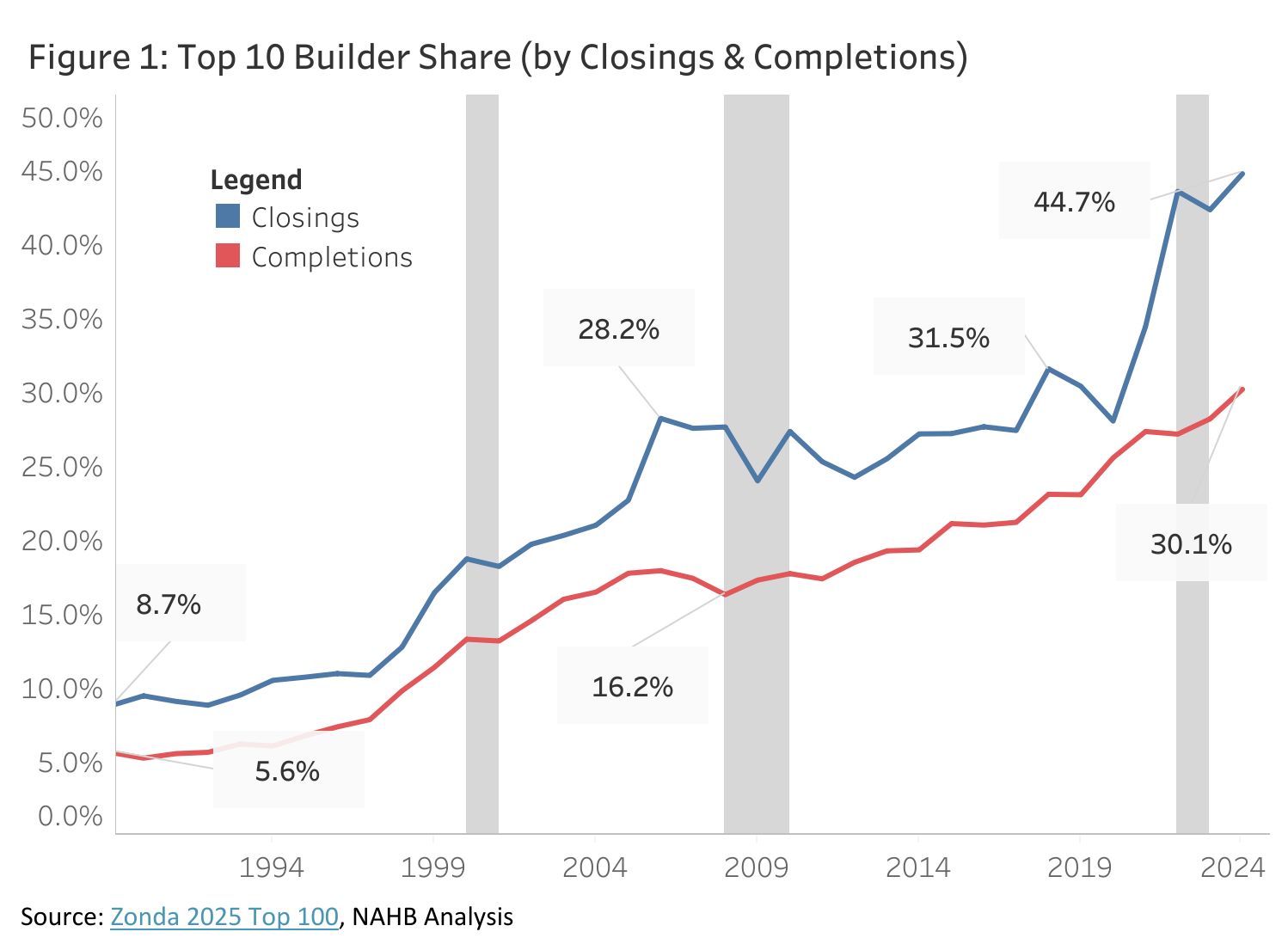
You can see this consolidation everywhere.
In homebuilding, the ten largest builders went from under 9% of the market to nearly 45% in three decades.
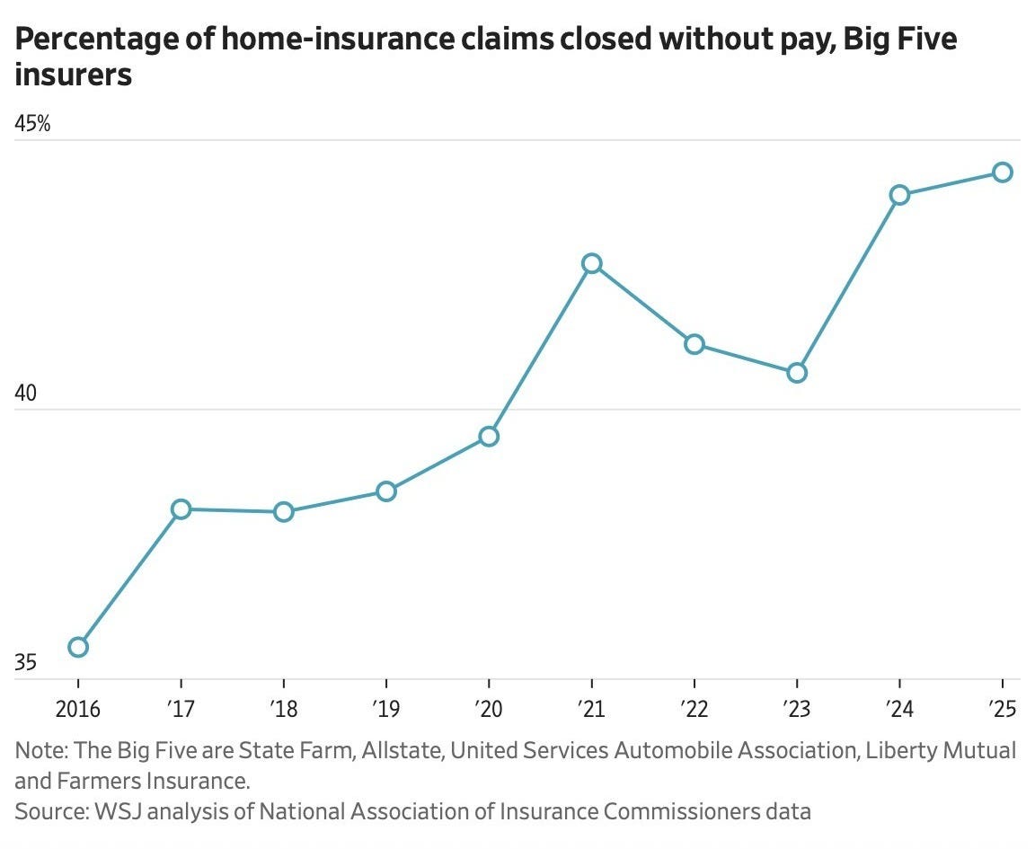
In home insurance, the five biggest carriers now close almost half of all claims with zero payout, a dynamic fueled by less competition and more market concentration.
Globalization and job offshoring are factors, but they’re not the whole story.
If offshoring were the main reason, every company that imported goods would have seen margins improve, but the same NBER paper shows this is not true. The median firm has not seen an improvement in margins. It’s the gains accruing to the “superstar” firms, as the paper calls them.
Also, the improvement in margins is seen in sectors like services, where globalization doesn’t touch directly.
There are many factors that have contributed to this multi-decade trend. It’s not correct to say it’s all globalization, or it’s all corporate greed.
Other factors include weak antitrust, compliance costs that intentionally crush small firms, a tax code friendly to intangible assets, a patent system built for incumbents, and cheap capital for scalable winners.
The point is that industry concentration has happened everywhere; it’s causing corporate profit margins to rise to ever higher levels, it’s good for shareholders, but bad for the average worker.
Where This Goes, And What You Can Do
Left alone, this compounds in two directions.
For the worker, it gets worse. Wages capture less of the pie every year, income growth slows, and the wealth divide accelerates.
For the capital owner, it gets better. The ever more profitable industry-leading firms become more durable, more dominant, and command higher share prices.
Both are true at the same time, and that is the part that’s hard to hold.
Here’s the uncomfortable trade everyone is making. It’s been correct for decades, and it will stay correct until something structural breaks.
If you own stocks, you own the winning side. Pricing power keeps flowing to the dominant firms in every industry, which is exactly why large-cap indexes have stayed so well supported. Record margins are the foundation under the entire bull case.
But that foundation is built on a consumer who gets squeezed a little thinner every year. And a foundation like that doesn’t crack on a schedule you’ll read about in the headlines.
It cracks in a surprisingly narrow window, usually before the data confirms anything is wrong.
That’s the part this post doesn’t cover.
The structural story tells you what to own and why it’s been working, but it doesn’t tell you when you’re exposed.
Knowing where the economy sits in its sequence, and how to be positioned so a structural winner doesn’t turn into a cyclical loser at the worst possible moment, is a different question entirely.
That’s what I write about every Sunday: a free newsletter that provides the framework behind where we are in the cycle, and what the next 1–2 years likely look like.
New subscribers also get our free guide to the housing cycle, which teaches the framework from the ground up, focusing on residential construction - the most important sector in the economy.

Please enlighten us on your thought process on how you arrived at this conclusion:
“In home insurance, the five biggest carriers now close almost half of all claims with zero payout, a dynamic fueled by less competition and more market concentration.”
The statistics from the regulators and industry groups alike soundly dispute this assertion.
By superstar firms you mean monopolies right? It's pretty obvious we're in this position because almost every sector has concentrated market power and the US government has done no antitrust. The politicians on both sides have do nothing but kowtow to the special interest groups representing these monopolies which is why we are where we are.