

How to Read the Jobs Report: A Data-Driven Approach
A systematic approach for analyzing labor data within the full Business Cycle Sequence.

Each month, the Bureau of Labor Statistics publishes the Employment Situation report, which is the most anticipated economic release of the month, next to the Consumer Price Index (CPI).
The Employment Situation report contains thousands of data points on the labor market, but it is most known for the monthly nonfarm payroll figure and the unemployment rate.
Laughably, financial media analyzes the entire report within seconds after attempting to “guess the number,” commenting only on whether the monthly nonfarm payroll number “beat” or “missed” consensus expectations. Secondarily, there is a passing comment about the unemployment rate.
Of course, this type of instant analysis is ridiculous, but it is common across all economic data releases.
In this post, we’ll highlight a sequential approach for analyzing the jobs report, one that provides layers and offers a dynamic view of the labor market, deeply assessing the health of the employment situation with forward-looking information and monetary policy considerations.
The Economy (and Labor Market) Moves in a Sequence
The economy moves in a predictable sequence, which is the basis of the Four Economy Framework that we use at EPB Research.
The economic cycle sequence has remained the same in every Business Cycle, from the inflationary 1970s to the more modern 21st-century recessions.
Some sectors of the economy are more sensitive to interest rates and credit conditions, meaning they must react first to changes in monetary policy.
The labor market, therefore, follows the same pattern and offers the most critical insights about where the economy is today, and where the momentum is heading over the coming quarters.
The two most interest-rate and credit-sensitive sectors in the economy are construction and manufacturing, broadly speaking. The labor markets of these industries are responsible for the vast majority of recessionary job losses.
As a result, when analyzing the jobs report, it’s far more informative to analyze the health of construction and manufacturing rather than total nonfarm payrolls because you will spot trend changes and inflection points first, as they always occur in these sectors before bleeding into the aggregate statistics.
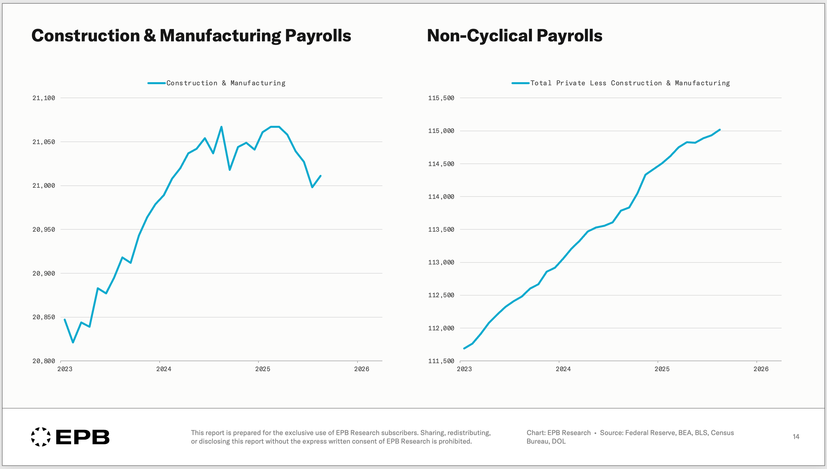
As the chart below shows, private payrolls can be divided into construction & manufacturing payrolls and all other (non-cyclical) payrolls.
The narrative today is that the labor market is weakening, but this is not evident in non-cyclical sectors; it is only in construction & manufacturing payrolls.
Within construction there is residential and nonresidential. Within manufacturing there is durable goods and nondurable goods.
Residential is more cyclical than nonresidential, and durable goods are more cyclical than nondurable goods.
The chart below shows the growth rate in employment for residential construction & durable goods manufacturing (blue), total construction & total manufacturing (orange), and total nonfarm payrolls (purple).
Clearly, the most cyclical grouping, residential construction & durable goods manufacturing, can be seen contracting first heading into the last few business cycle recessions. Focusing on total nonfarm payrolls can leave you years behind when inflection points occur.
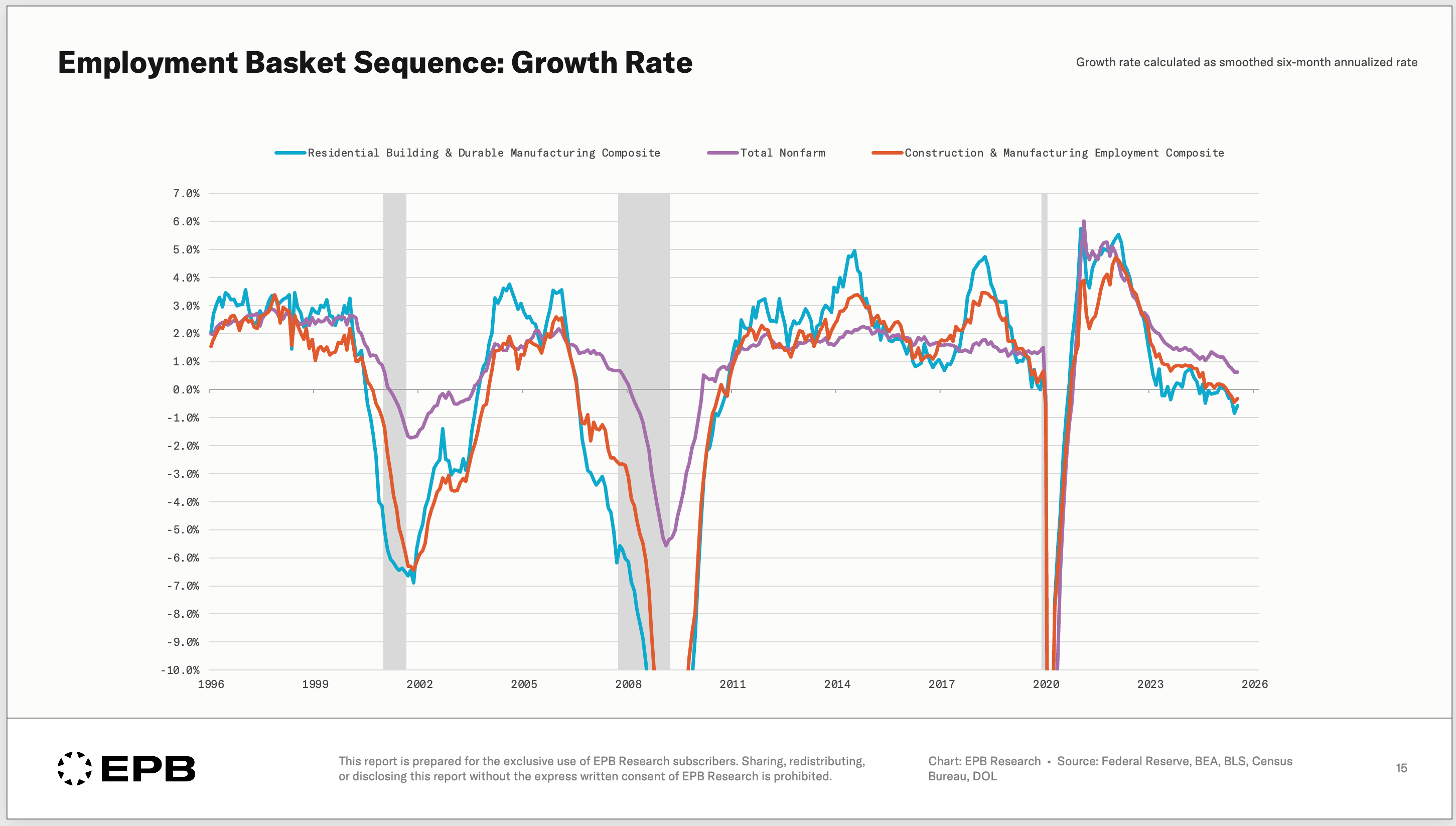
Important information can also be gleaned from when the growth rate in the cyclical sectors (blue) breaks away from total nonfarm payrolls (purple).
Notable inflection points occurred in March 2000, July 2006, July 2019, and March 2023.
The chart below shows the Federal Funds Rate with these four inflection points noted.
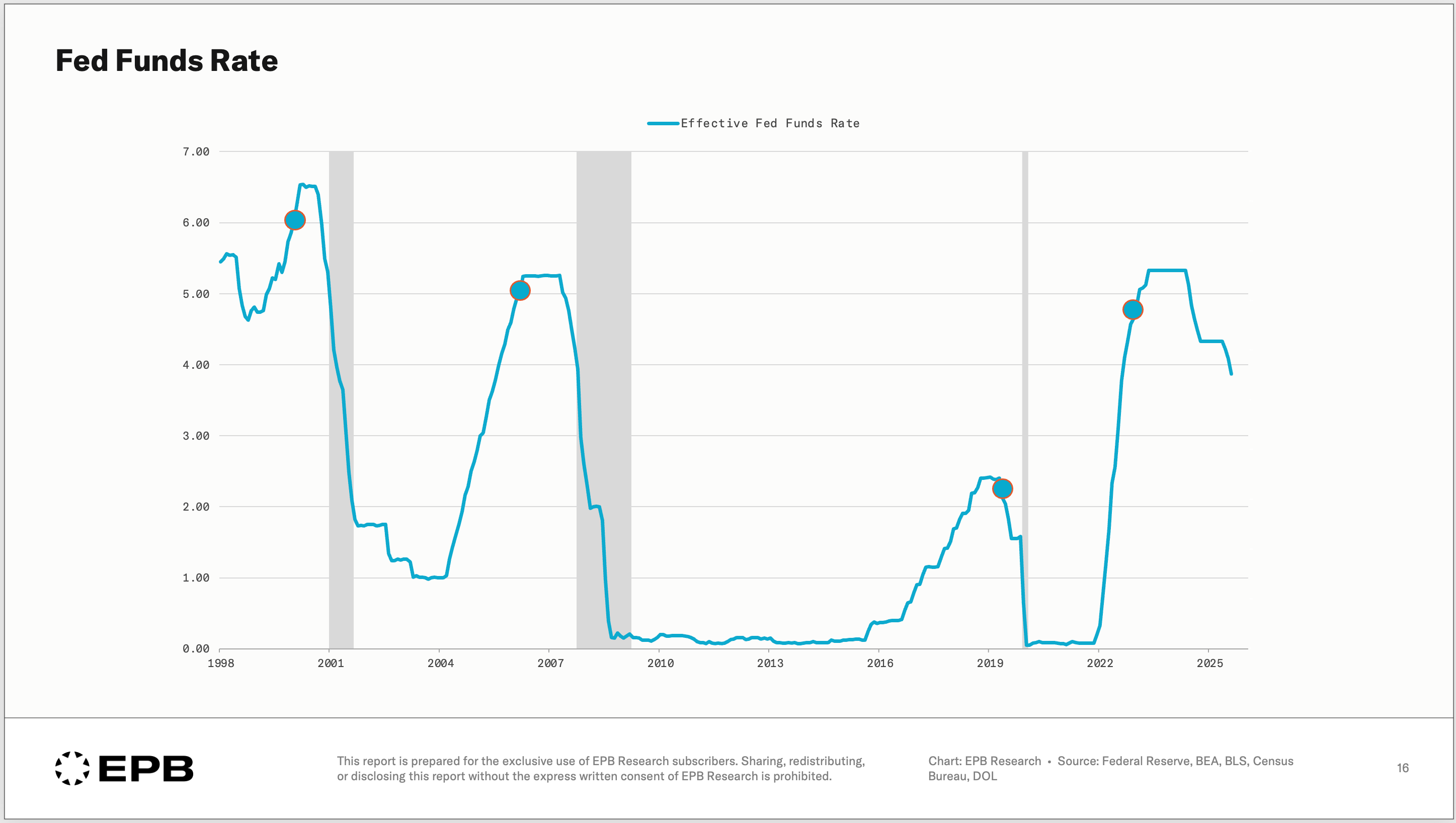
Nothing in Business Cycle analysis is meant to be used as a trading timing tool, and this breakdown is no exception. However, the sequential deterioration of the most leading labor categories is an important signal for future monetary policy trends.
So when the jobs report is released, the monthly payroll addition is completely irrelevant. What matters is the trending growth rates and sequential breakdown across leading, cyclical, and lagging sectors. This is where the information lies.
Unemployment Rate: The Gold Standard
The sectoral breakdown of payrolls mentioned above comes from the “Establishment” survey of employment. The benefit of the Establishment Survey is its granular breakdown of labor sectors, which enables sequential analysis. The drawback is that the survey comes with substantial revisions.
The “Household” survey of employment is the opposite. It does not hold granular sectoral breakdowns, but it does not come with heavy revisions; in fact, revisions are often minimal, making the unemployment rate, which comes from the Household Survey, the gold standard measure for the labor market at any given moment.
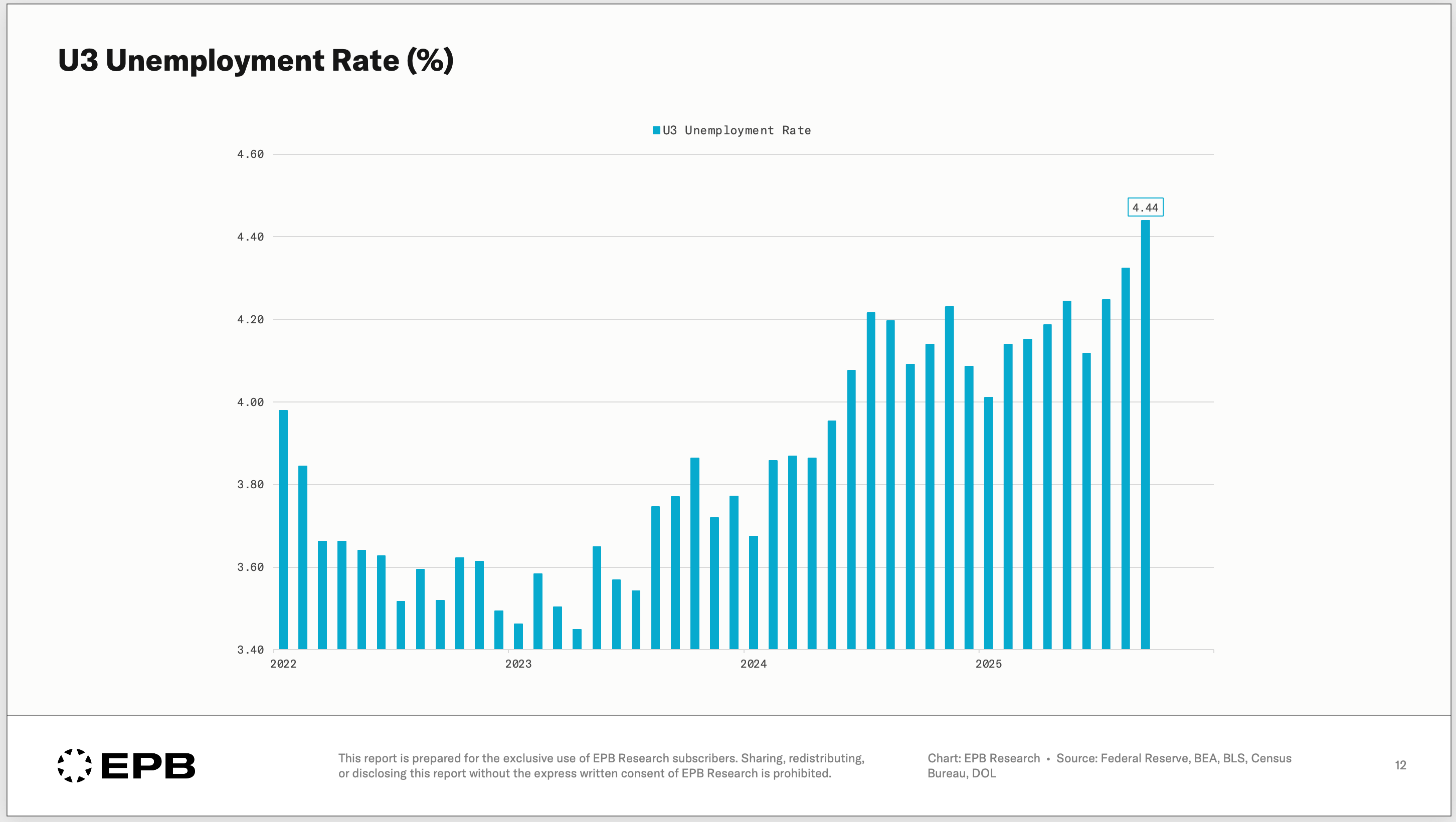
This is not a leading indicator, and it does not offer any information about where the labor market is going in the future, but we can see the current status of the labor market and the trending momentum.
Charted above is the U3 unemployment rate, which clearly demonstrates a worsening trend, a cycle high in the unemployment rate, but a level of unemployment that is not yet alarming, 4.44%.
However, coupling the two surveys and looking at the report more dynamically helps plug the holes. The unemployment rate is rising, it is at a cycle high, AND we see the worsening coming from the common and predictable cyclical sectors after a monetary policy tightening cycle. A more three-dimensional view of the labor market becomes clear.
Adding The Layers
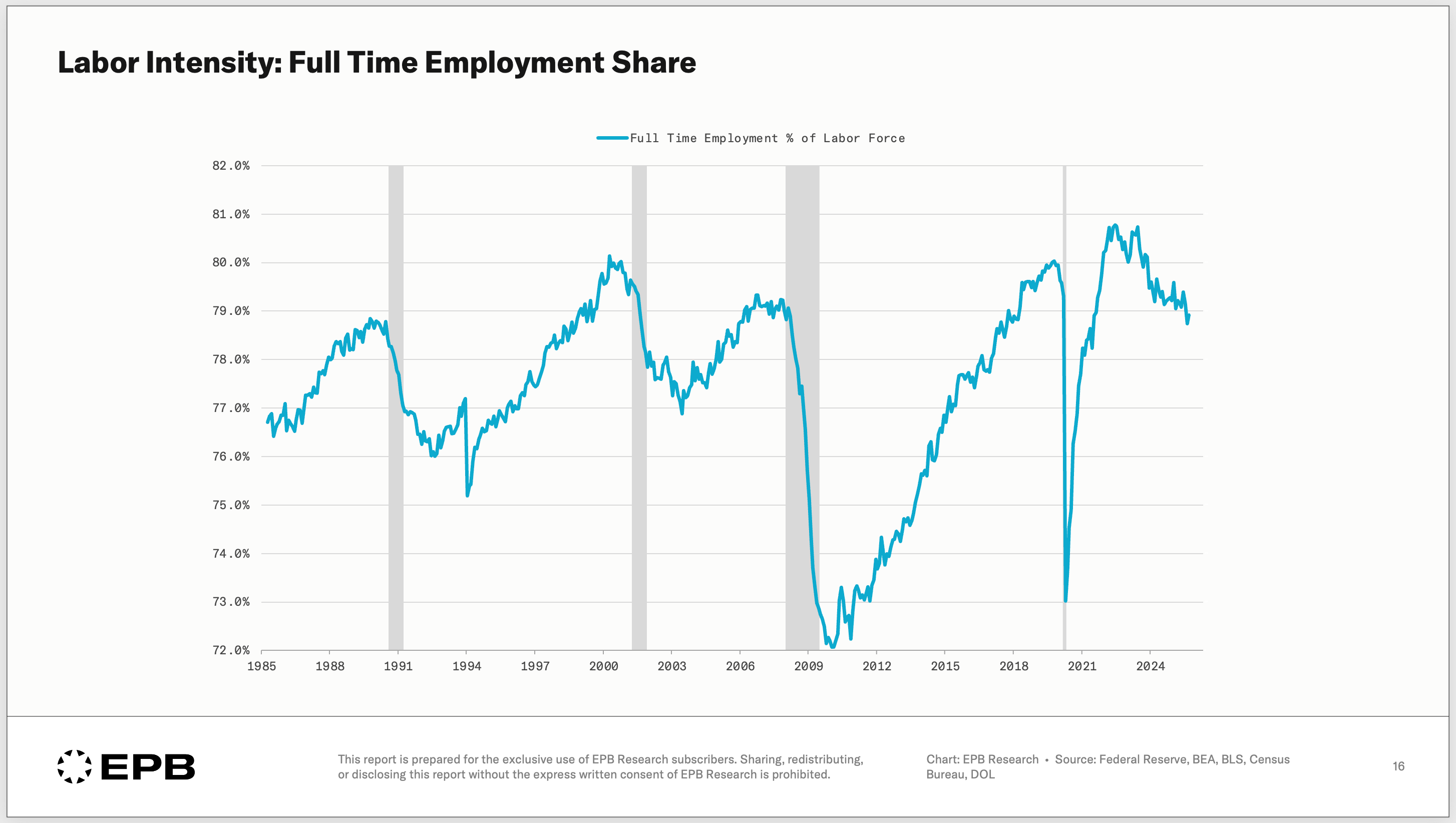
The jobs report holds even deeper information, including full-time and part-time employment.
The chart below measures full-time employment as a share of the labor force.
When the labor market is hot, and companies need a lot of work, they hire more full-time workers. At the peak of the pandemic boom in 2021, full-time employment reached nearly 81% of the labor force, the highest level ever.
That has since cooled to below 79% as demand softened and companies need fewer labor hours.
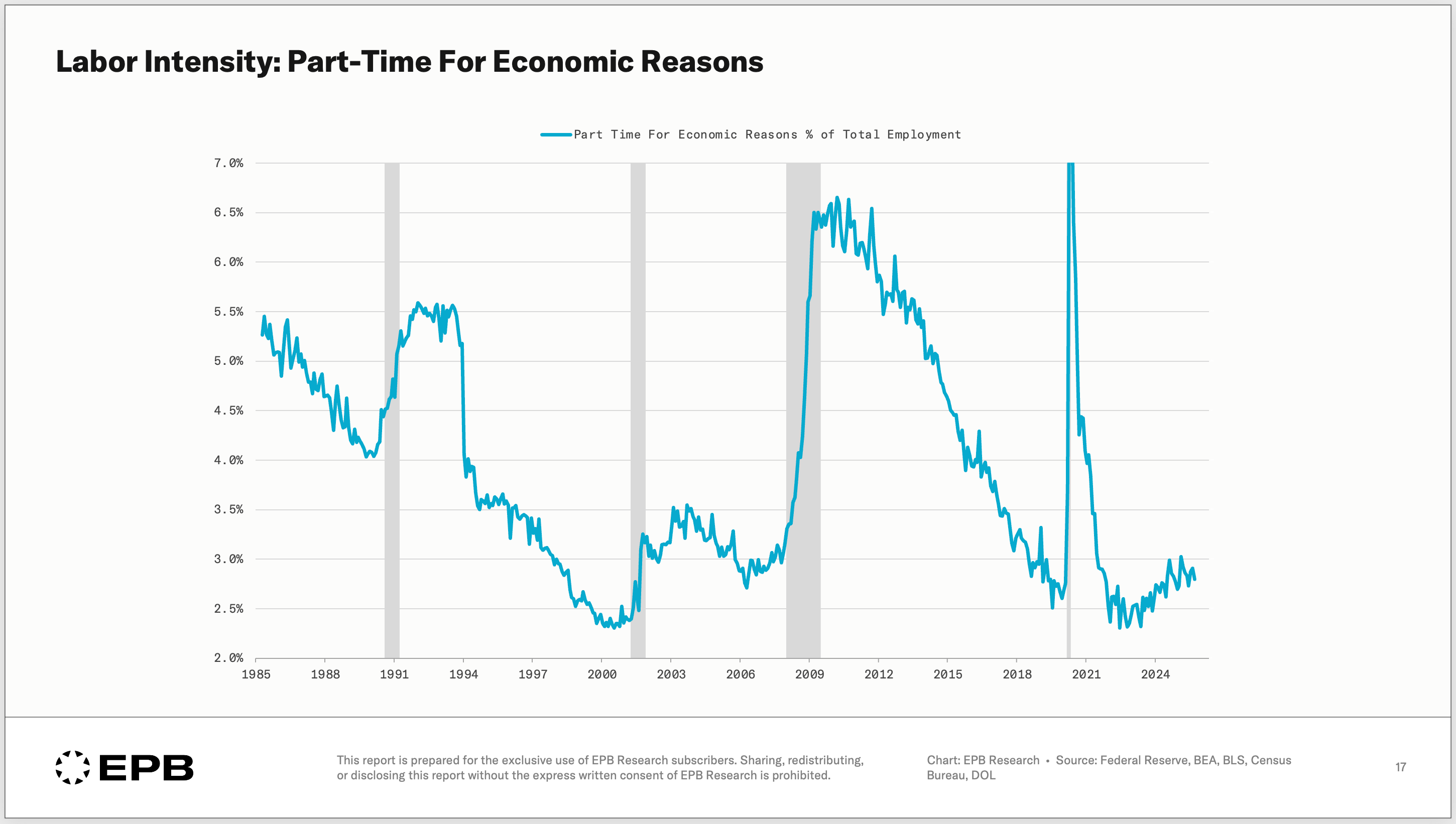
People can work part-time for “economic” reasons or “non-economic” reasons.
Economic reasons essentially mean you want a full-time job but can’t find one.
Non-economic reasons are a choice that you want to work part-time.
The chart below shows the share of total employment working part-time for economic reasons.
At the peak of the pandemic boom in late 2021, less than 2.5% of employed people were part-time for economic reasons. That has increased to roughly 3%. Not a dramatic increase, but directionally a bit weaker.
Many of the trends discussed so far were present at the start of 2025 and, by the spring and summer of 2025, were certainly evident, allowing us to predict that the labor market would continue to weaken in our post, “Cracks Are Spreading in the US Labor Market.”
The softening labor market has now become a consensus viewpoint at the Federal Reserve and a daily talking point on financial TV.
Today, the unemployment rate sits at a touch over 4.4% and in the FOMC Summary of Economic Projections, a move above 4.5% is not expected by a vast majority of committee members (highlighted in blue).
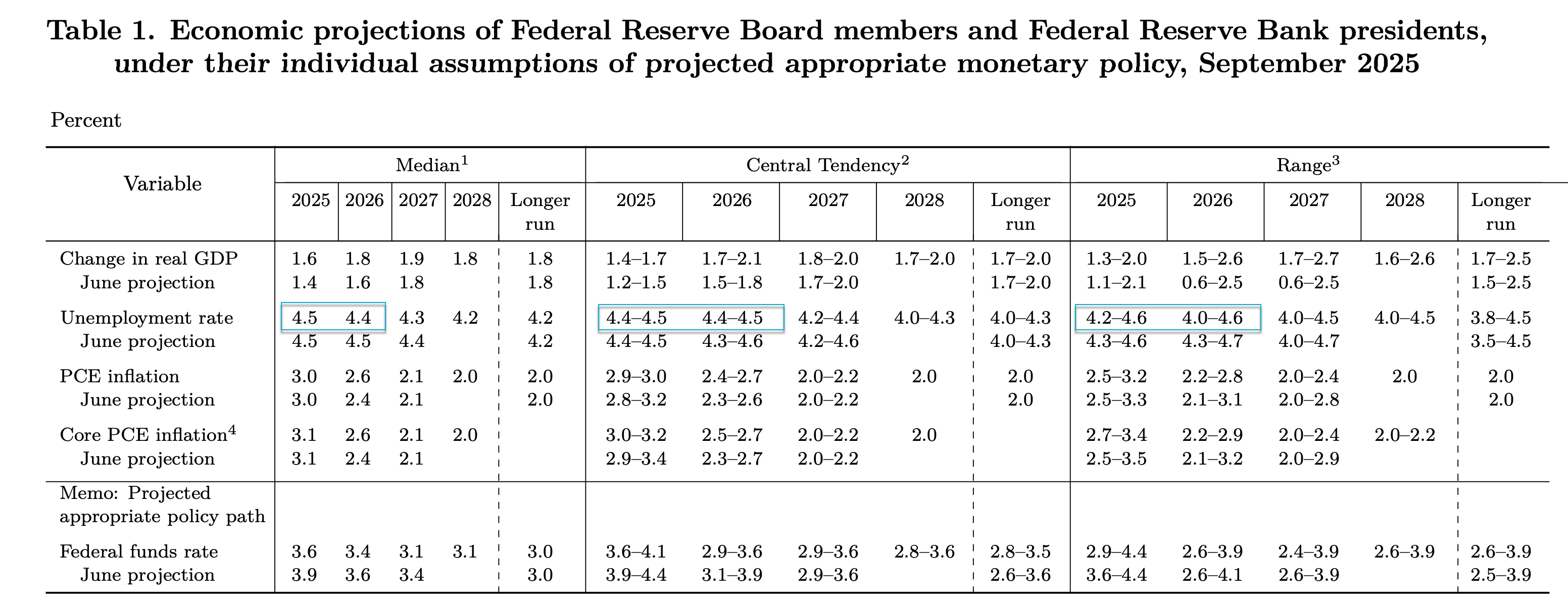
It’s highly likely the unemployment rate exceeds the 4.5% level, given the sequence of deterioration (starting with the cyclical sectors), the throttling of labor intensity in the form of less full-time and more part-time work, and the trending momentum that already exists in the U3 rate.
For an FOMC that has clearly shown a preference or bias for labor over inflation, further adjustments lower in the Fed Funds rate should be expected.
Do More Than “Guess The Number”
When the jobs report comes out, do more than guess the number. Look at the sequence of payroll gains/losses, the trends in the unemployment rate, metrics of labor intensity, and more. This will offer much more granularity and clarity about the current state of the labor market and the likely future direction.
If you enjoyed this level of analysis, the full jobs report is reviewed inside EPB Research via our Operator Access Package each month.
Each monthly employment update includes a complete breakdown and sequence of nonfarm payrolls, historical data revisions, unemployment rate trends, and leading employment indicators.
Each report is analyzed through the lens of the Business Cycle Sequence, presented in written chartbook format as well as with animated video.
You can access the complete monthly jobs report, in addition to our flagship Business Cycle Trends report and our Weekly Economic Briefings, by subscribing to the EPB Operator Package at the link below.
EPB Research's Business Cycle Sequence is consistently penetrating and insightful. Thank you for sharing a perfect example of what I am asserting.
Informative & helpful